
Jewelry product page CRO is about removing uncertainty before a high-consideration purchase or consultation. Improve sizing, photography, fulfillment clarity, trust evidence, and the primary action on mobile.
Conversion optimization on a jewelry website begins with uncertainty. Buyers wonder whether the stone will look right, whether the ring will fit, what the material really is, and what happens if the gift is unsuitable. A stronger page answers those questions at the moment they arise.
Match jewelry product page CRO to the right buying action
An in-stock necklace may need a prominent Add to Cart button. A custom engagement ring may need “Book a consultation” or “Request a quote.” A high-value diamond can benefit from an option to speak with a specialist. Do not force every product into the same action when the buying processes are different.
Keep the primary action visible on mobile without covering crucial product information. Test the complete process from tapping the action to confirmation, including validation messages and follow-up emails.
Explain what the shopper is seeing
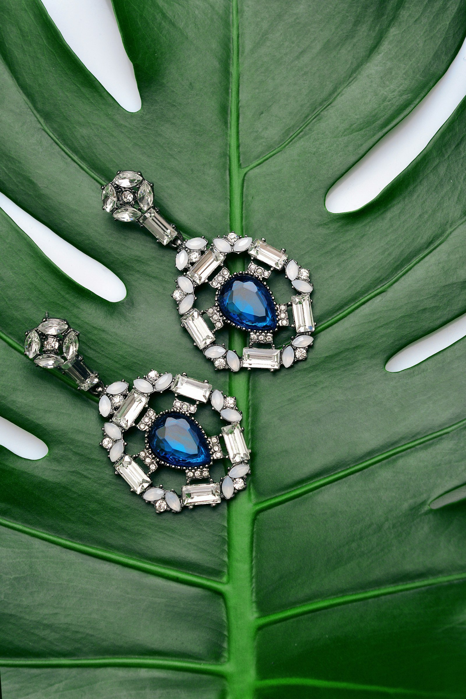
Use clear names, verified specifications, multiple photography angles, and an understandable size or scale reference. For a ring, show a side profile as well as a hero shot. For earrings, include dimensions and backing style. If variants alter the appearance, update the image when the selection changes.
Make metal purity, gemstone characteristics, setting details, and customization options easy to find. A product description should tell buyers what is distinctive, not rely on generic adjectives such as luxurious or timeless.
Put policy reassurance near the decision
Show delivery estimates, shipping fees or calculation rules, returns eligibility, warranties, resizing options, and secure checkout information in concise language close to the purchase action. Custom and engraved pieces often have different policies, so communicate the distinction clearly.
Do not present trust badges that cannot be verified. Authentic customer reviews and helpful service contact details often reassure better than decorative icons.
Reduce variant-selection friction
Test metal, gemstone, carat, ring size, and engraving selectors. The page should explain required fields, show accurate price changes, and prevent unavailable combinations from being added to cart. Provide a size guide without forcing the shopper to abandon the product page.
On mobile, check how selectors, galleries, and sticky buttons interact. A common failure is a visually attractive interface where the next required field is hidden below an overlay.
Use behavior data carefully
Review product views, gallery interactions, size-guide use, add-to-cart rate, checkout starts, purchases, and qualified enquiries. Session recordings and heatmaps can suggest friction, but do not infer user motivation from a single recording. Pair quantitative signals with real customer feedback and staff observations.
Prioritize tests that solve specific problems. If many visitors open the size guide and then leave, improve sizing clarity. If mobile users abandon when shipping is revealed, test earlier policy transparency. Measure a sufficient sample before deciding a change helped.
Keep SEO and CRO aligned
Do not bury the product grid beneath an SEO essay or remove meaningful content just to shorten the page. Structure specifications, FAQs, and buying help so both searchers and shoppers can use them. A clear product page can serve commercial intent while supporting accessibility and search discovery.
Explore jewelry conversion rate optimization for a focused UX review, or jewelry SEO audit for the full search-to-sale journey.
Related reading: Our product page SEO and site speed guides cover connected improvements.
